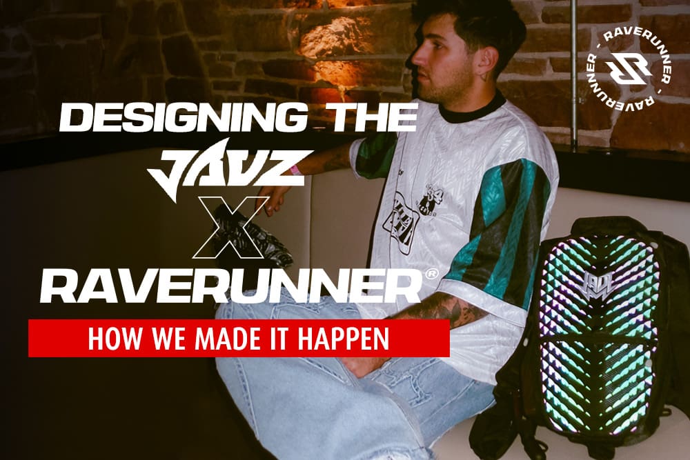
Designing the Jauz x RaveRunner®: How we made it happen
Step 1: Finding the Shark Vibes
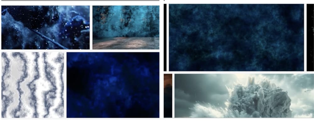
We kicked things off by digging into Adobe Stock, looking for “sharky” inspiration. Honestly, nothing felt right. So, we went straight to the source: his logo. That shark fin? It gave us major “techie shark scale” vibes—scary, sleek, but with a touch of cool.
We played around with patterns. Took the logo, repeated it, twisted it, tried to make something click. And it was all… eh.
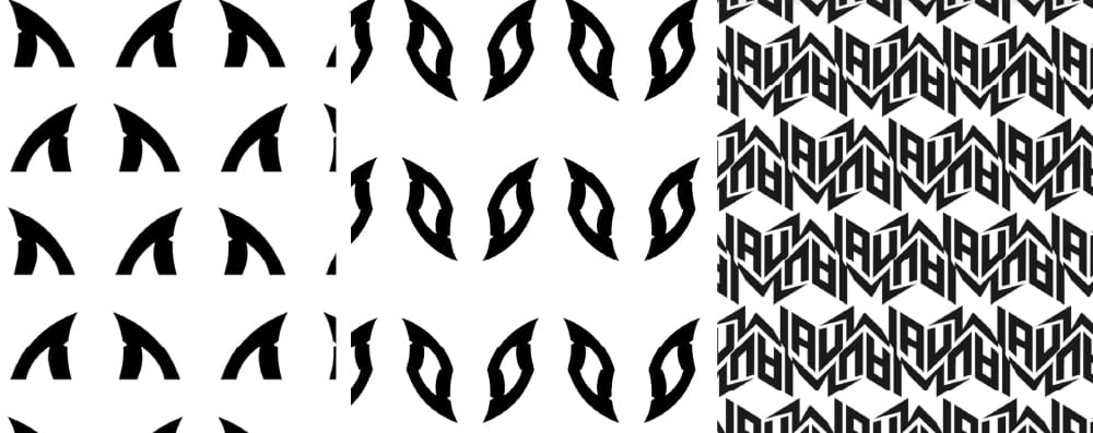
Then it hit us: shark’s kind of diving, digging it, spread it open.

Step 2: Building the Look
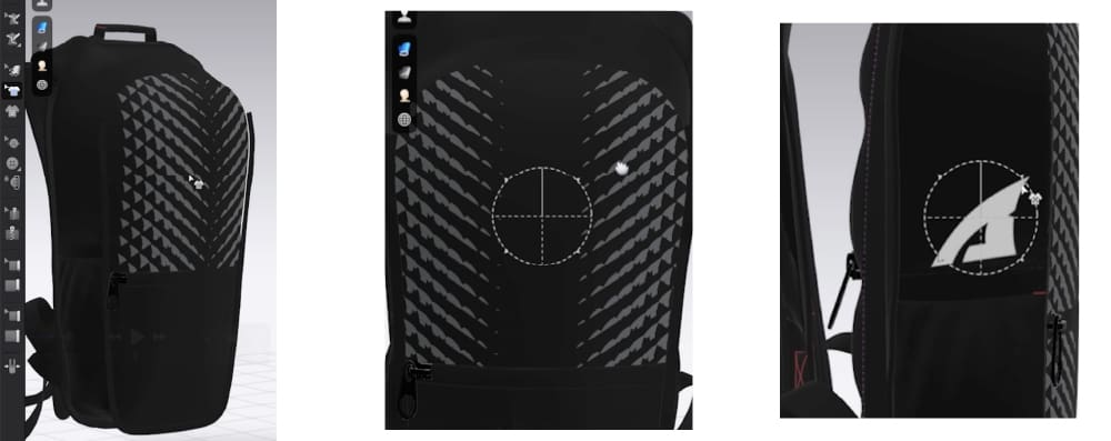
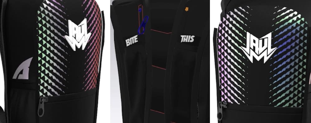
Once we had the shark diving concept, we moved into CLO to mock it up on a hydration pack. That’s when the real magic started.
- Material Matters: Black always looks sick, but it needed something extra. Reflective material? Game changer.
- Placement Is Key: We threw the shark fin onto the sides, creating the illusion of a shark diving under the pack. It looked sleek and dynamic, perfect for the rave crowd.
We also wanted to level it up with some upper-echelon details. That’s where the embroidery came in—clean, bold, and premium.
Step 3: Tying It All Together
Jauz had just relaunched his label, so it was a no-brainer to include that detail in the design. We worked it into the render, and when we saw the reflective material light up. We knew we were onto something special.
The final product? A pack that’s bold, functional, and just screams Jauz.
The Best Part? Jauz Loved It.
He’s a Niners fan (so yeah, we had to throw in a little “Go Birds” banter), but when he saw the pack, it was nothing but love. He was stoked, we were stoked, and now we’ve got a sick collab that’s turning heads on and off stage.
This drop is special—reflecting not only Jauz’s vibe but also the RaveRunner® community that values style, utility, and a bit of edge.
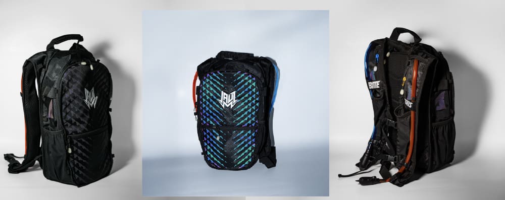
Check it out at raverunner.co. But heads up: it’s moving fast. Don’t miss out on snagging yours before it’s history.